


Designing Navigation for Responsive Websites
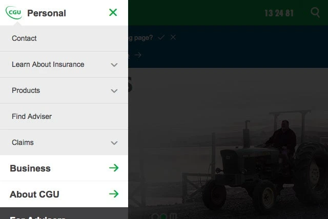
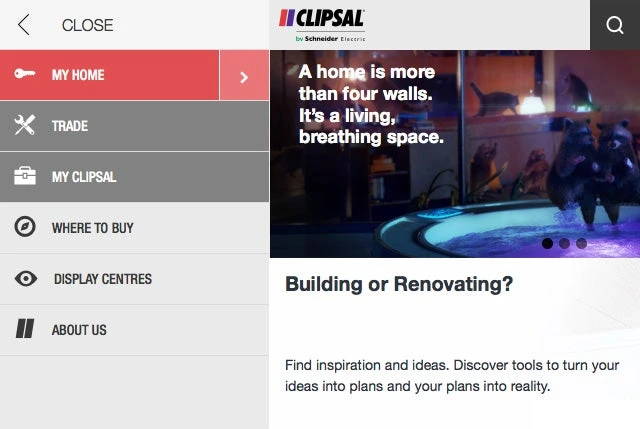
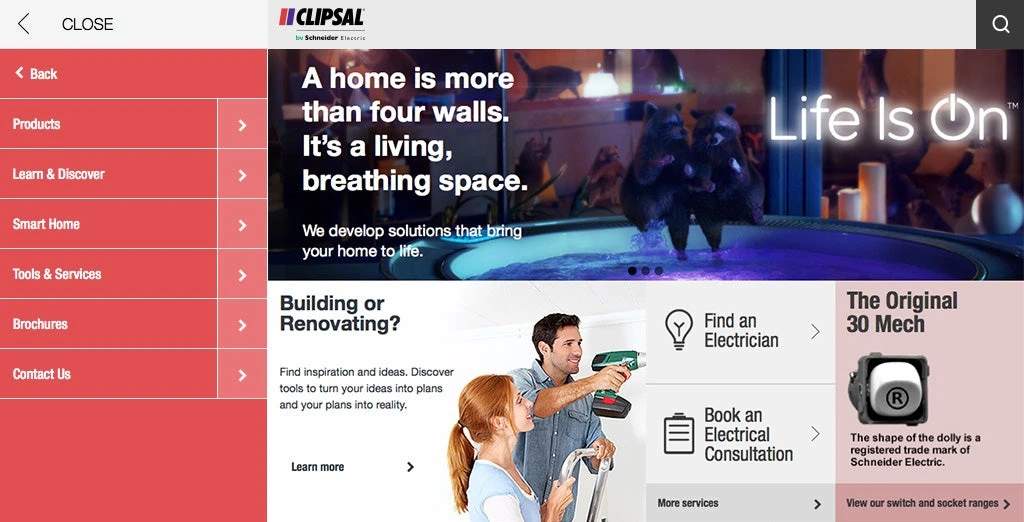
Prioritise primary tasks and place secondary categories in expandable groups. Mobile navigation should show the current page and support keyboard closing with focus returned to its trigger.

Putting visual design and experience into practice
Visual hierarchy should match information priority. Typography, imagery and spacing determine what visitors notice first and how they understand the next information.
Checking the result
Compare home and detail pages at the same scale, including long headings, real imagery and mobile order. Connect observations to concrete areas and tasks.