



Starting with the moments that matter
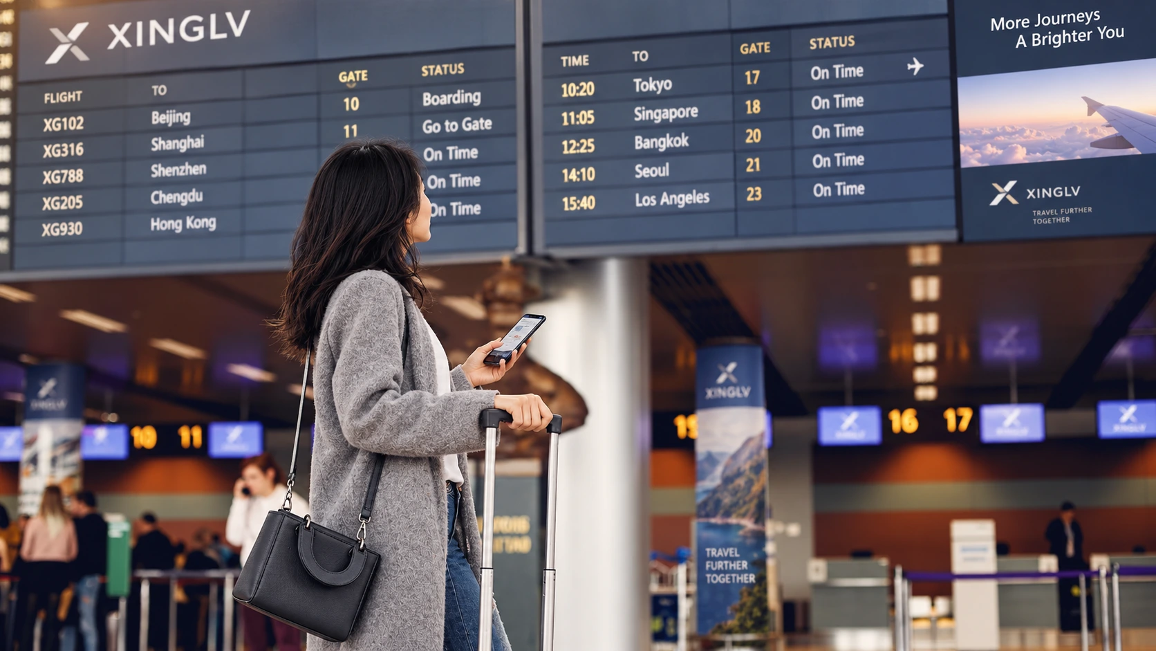
Airport searches have an immediate purpose: checking a flight, finding a gate, meeting someone or choosing a meal between connections. Xinglv puts those tasks at the centre of the concept.
Departures, arrivals and connections organise the information, linking flights with transport, parking and terminal services. Teal, generous space and concise labels create a calm visual language.
Turning a map into a route
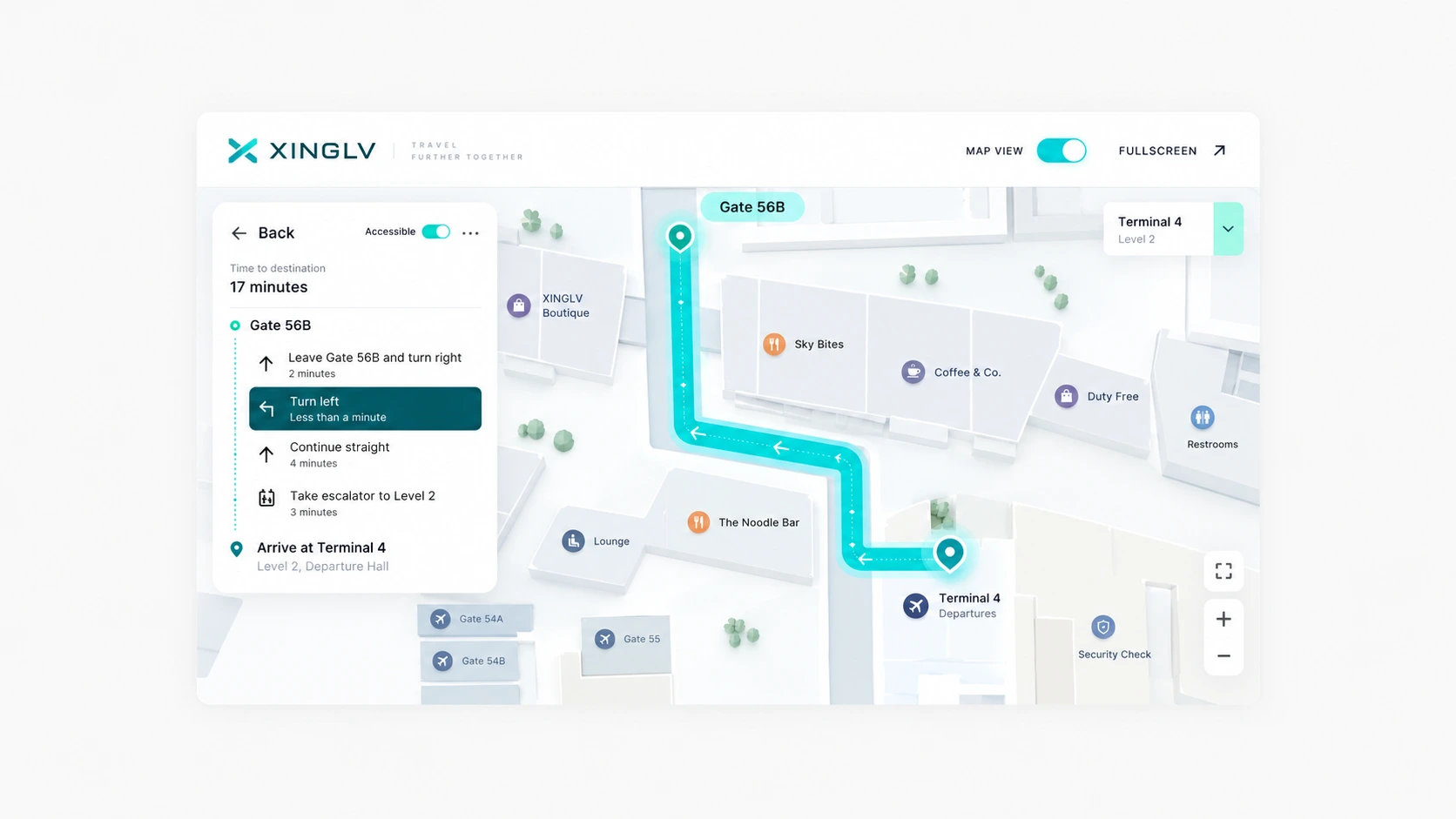
The terminal map retains essential architecture and quiets secondary detail. Distinct endpoints and a highlighted route work alongside a step list that translates space into actions.
The desktop study pairs a full map with a side panel; mobile places the current step over the map. Both views follow the same route, connecting planning with on-the-move reference.
Bringing services into the journey
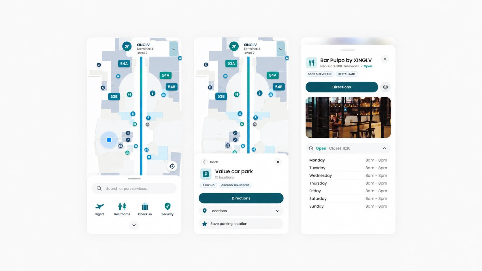
Parking, dining, lounges and accessible facilities have distinct details without becoming isolated destinations. Service cards bring location, status and directions together.
Maps, flights and parking states use illustrative data. The study establishes interface structure and information relationships; live data and navigation accuracy require separate implementation and validation.
Six details that support the journey
From parking to the gate, each card has one primary purpose. Shared status colours, icons and action placement create a familiar reading pattern across services.
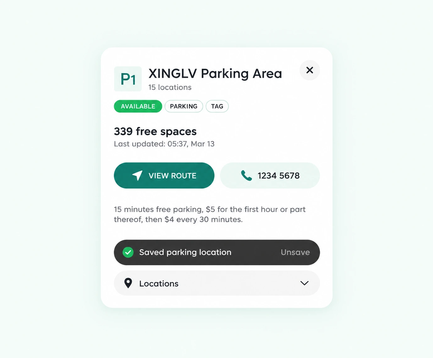
Parking availability at a glance
The parking card leads with its zone and availability, followed by detail and directions. Clear hierarchy answers both whether a space is available and how to reach it.
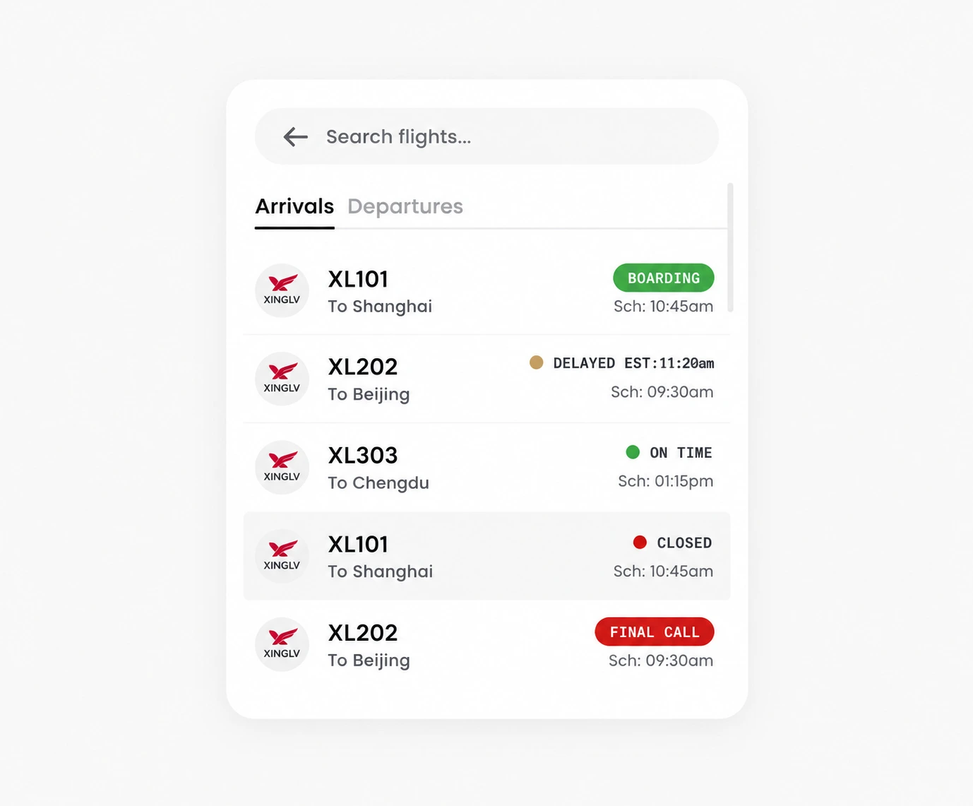
Flight states with a clear hierarchy
The flight list aligns time, destination and boarding status for quick scanning. Text accompanies each colour-coded state, so colour is never the only cue.
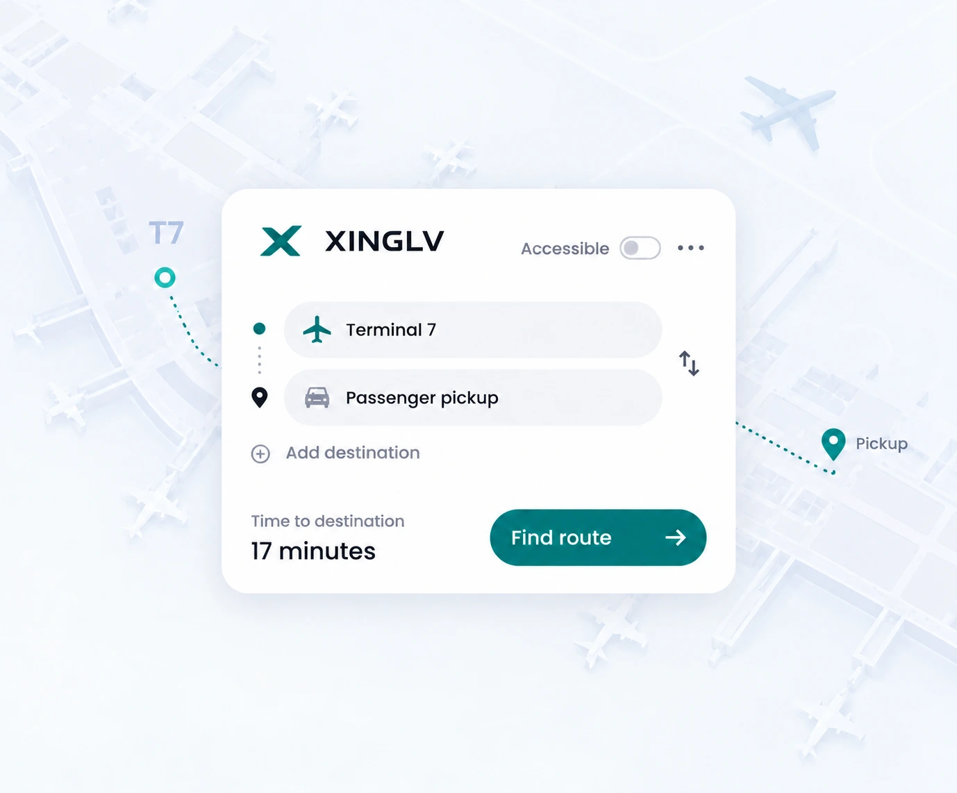
A simple starting point for directions
The directions panel gives origin and destination clear fields, with a nearby swap control. It collects the essential choices before presenting the route.
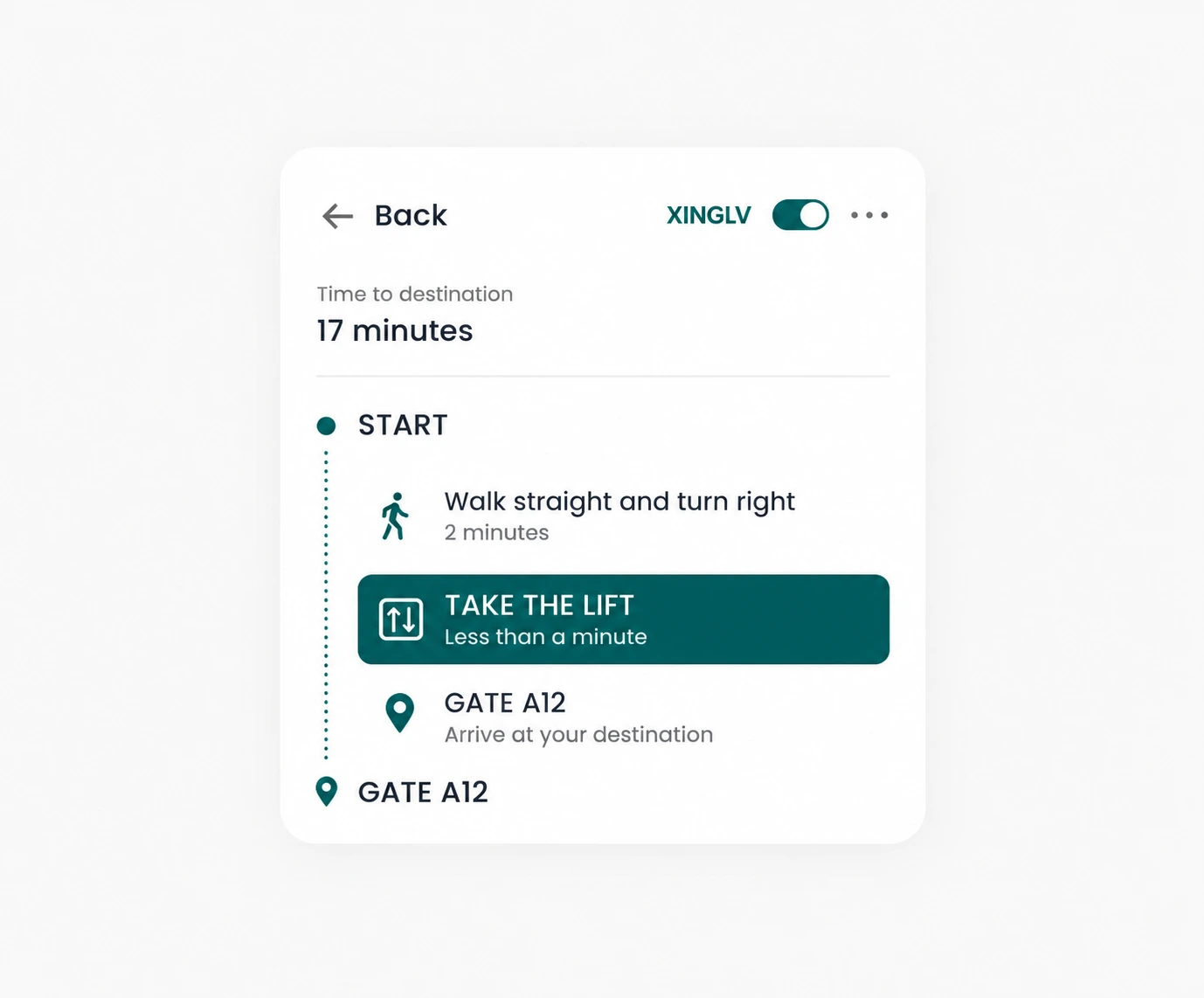
Accessibility within the main journey
Step-by-step guidance pairs walking, lifts and gates with recognisable icons. Connected steps and a prominent current action give accessible routes the same design attention as other journeys.
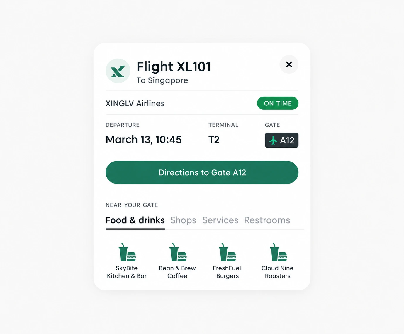
Useful choices while waiting
Nearby dining and facilities extend from the flight detail card. The sequence follows a traveller’s priorities: confirm the flight, then decide how to spend the waiting time.
Services in familiar categories
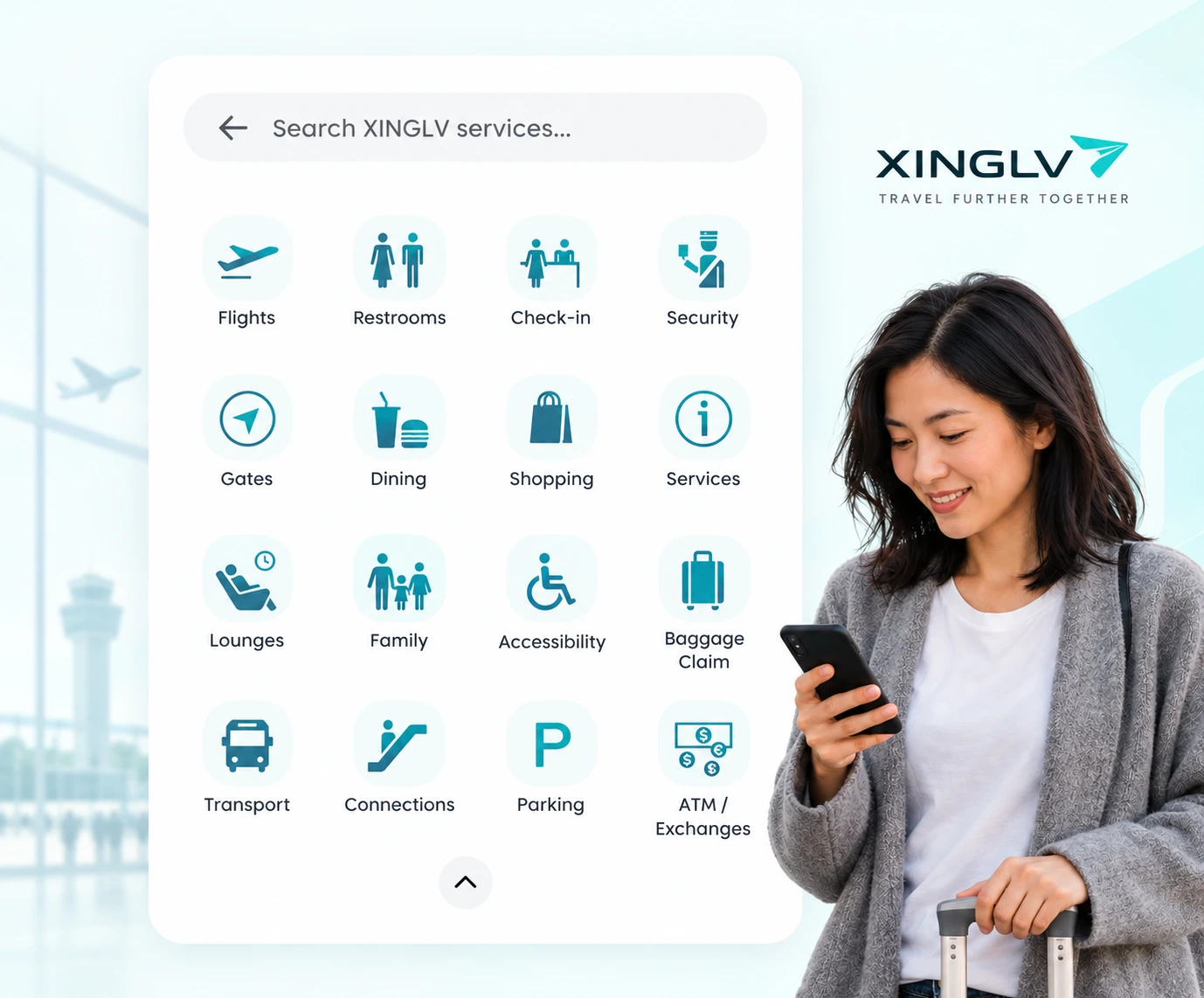
Dining, shopping, lounges, family facilities and transport use consistent icons and labels. Categories provide a starting point for first-time visitors, while search supports a direct lookup.
A more confident journey
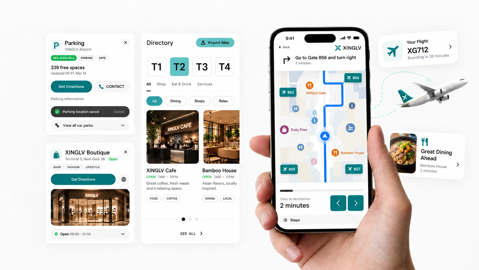
The final composition brings the mobile map, flight cards and service panels together as parts of one journey. Restrained visual treatment keeps information at the centre.
The concept connects pre-trip planning with finding information inside the terminal. Its focus is a coherent task structure that makes a complex place easier to understand.
“A considered travel experience leaves more attention for the journey.
Keep exploring
Explore more design directions for your brand.